DdsButtonTagHelper class
Estimated reading time: 10 minutes
Defines a clickable element that can be configured as a replacement of a DdsField.
Namespace: ASNA.QSys.Expo.Tags Assembly: ASNA.QSys.Expo.Tags.dll
Inheritance: Object –> TagHelper
Remarks
Interactive IBM i Legacy Applications present data to the user on the screen then allow the user to enter additional data and press Enter, or a Function Key, to continue the execution of the application. As part of the information sent from the screen to the application, the location of the cursor (row,column) and the Function Key pressed is included.
Expo applications function the same way, allowing users to use their keyboards to enter data and press function keys on their keyboards. The DdsButton provides an alternate way for the user to select the function key desired. The DdsButton also allows the programmer to simulate the location of the cursor when the DdsButton is pressed along with the name of then input field and even provide some data on the field when the DdsButton is clicked.
An attention identifier (AID) is the way of specifying the function key used by a user. To set the name of the function key being impersonated by the DdsButton use the property AidKey.
A programmer enables which function keys are available to the user by listing the keys in the Model at the File level, using the DisplayPage attribute, or at the record level utilizing the Record attribute, in both cases the attribute’s FunctionKeys property is used. If the key is to be enable only sometimes then an indicator expression can be provided.
In order for the DdsButton to be rendered and available on the screen, the corresponding function key which it impersonates should be enabled by the application. For instance, if the programmer adds a DdsButton with its AidKey set to F4, then the function key F4 should be enabled by the application at either the File or the Record level.
Simulating Cursor Position
Some legacy applications used a technique where the user was able to position the cursor on an input-capable field and press one of the available Function Keys to submit the Page. Application logic would identify the pressed Function Key combined with the location of the cursor (next to a named field), and determine the action to take.
Modernized Applications may want to provide additional HTML Button elements in strategic places on the Page, to improve usability.
Reporting a Field Name
To maintain the Legacy Application logic intact, DdsButton Tag Helper can simulate the action of navigating to the desired input element and pressing a specified AidKey.
For example, assuming that a Display Page has a Prompt feature, indicated with F4 valid for fields SFSTATE and SFSTATUS (record CUSTREC), the following two DdsButtons may be added to improve usability:
<DdsRecord For="CUSTREC" KeyNames="ENTER 'Submit'; F3 'Exit'; F4 'Prompt'; F6 'New Customer'; F11 'Remove Customer'; F12 'Back';">
    <div Row="2">
        . . .
        <DdsButton Col="91" ButtonStyle="Icon" IconId="search" AidKey="F4" FocusField="CUSTREC.SFSTATUS" IconTitle="Prompt for Status Codes" />
    </div>

    <div Row="7">
        . . .
        <DdsButton Col="40" ButtonStyle="Icon" IconId="search" AidKey="F4" FocusField="CUSTREC.SFSTATE" IconTitle="Prompt for State Codes" />
    </div>

<DdsRecord/>
The first DdsButton will appear on Row 2, Col 91 and when user clicks (or Taps with finger) on this button, it simulates that the cursor was located on field “CUSTREC.SFSTATUS” and the press of the F4AidKey
The second DdsButton will appear on Row 7, Col 40 and when user clicks (or Taps with finger) on this button, it simulates that the cursor was located on field “CUSTREC.SFSTATE” and the press of the F4AidKey
Both DdsButton appear as icons with the shape of a magnifying glass (typically used by search).
Note: The Application Logic remains intact.
Reporting a Row and Column Position
If the application is looking for the Row and Column where the cursor was positioned at the time the function key was pressed, then the programmer can use the VirtualRowCol property of DdsButton to simulate that position.
<DdsButton Col="40" ButtonStyle="Icon" IconId="search" AidKey="F4" VirtualRowCol="7,27" IconTitle="Prompt for State Codes" />
Setting a Value
In addition to having the DdsButton simulate the position of the cursor in a particular field, it is also possible to specify some value to be entered for the selected field.
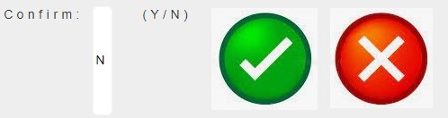
The following example shows an input capable field named VZCFCD used by the application to receive some confirmation. The two DdsButtons allow the user to simply click them to express her intention. Clicking the Confirm button will enter a ‘Y’ on the field VZCFCD of record format RCONFIRM and press <Enter>. Clicking on the Cancel button will simulate pressing the <F12> key.
<DdsRecord For="RCONFIRM" KeyNames="ENTER 'Intro.'; F12 'Cancel';" WindowLeftCol="50" WindowTopRow="22" WindowHeightRows="1" WindowWidthCols="38">
    . . .
    <DdsCharField Col="12" For="RCONFIRM.VZCFCD"  VirtualRowCol="24,73" Color="Blue" />
    <DdsButton Col="24" AidKey="Enter" ButtonStyle="Button" Text="Confirm" FocusField="RCONFIRM.VZCFCD" FieldValue="Y" />
    <DdsButton Col="32" AidKey="F12"   ButtonStyle="Button" Text="Cancel" />
    . . .
<DdsRecord/>

Focusing on a Subfile’s Field
To set a DdsButton’s FocusField property to a subfile field use this syntax:
<DdsSubfileRecord RecordNumber="rrn" For="SFLC.SFL1">
    . . .
    <DdsButton Col="7"  FocusField=@($"SFLC.SFL1[{rrn}].SFSEL") FieldValue="2" AidKey="Enter" Title="Update Customer" ButtonStyle="Link"   Text="Update" />
    <DdsButton Col="14" FocusField=@($"SFLC.SFL1[{rrn}].SFSEL") FieldValue="3" AidKey="Enter" Title="Display Sales"   ButtonStyle="Button" Text="Sales" />
</DdsSubfileRecord>
Button Styles
The DdsButton can be rendered in one of four styles:
- Button
- Icon
- Image
- Link
Button
To display the DdsButton as a link, set the ButtonStyle="Button" and the Text property to name the button.
    <DdsButton Col="24" AidKey="Enter" ButtonStyle="Button" Text="Confirm" FocusField="RCONFIRM.VZCFCD" FieldValue="Y" />
    <DdsButton Col="32" AidKey="F12"   ButtonStyle="Button" Text="Cancel" />
Icon
When displaying a DdsButton as an Icon, use one of the shapes provided by the library. The Icon Shapes are simple and clean, monochrome (color can be changed to any solid color), scaled without loss and respect the background (use transparent background).
To display the DdsButton as a link, set the ButtonStyle="Button" and set the name of the Icon to be used on the IconID property.
    <DdsButton Col="24" AidKey="Enter" ButtonStyle="Icon" IconId="check"         Color="green" FocusField="RCONFIRM.VZCFCD" FieldValue="Y" />
    <DdsButton Col="32" AidKey="F12"   ButtonStyle="Icon" IconId="remove-circle" Color="red />
Image
To display the DdsButton as an image, set the ButtonStyle="Image" and set the Image property to the URL of the desired image.
    <DdsButton Col="24" AidKey="Enter" ButtonStyle="Image" Image="/images/confirm.jpg" FocusField="RCONFIRM.VZCFCD" FieldValue="Y" />
    <DdsButton Col="36" AidKey="F12"   ButtonStyle="Image" Image="/images/cancel.jpg" />
Link
To display the DdsButton as a link, set the ButtonStyle="Link" and the Text property to name the link.
    <DdsButton Col="24" AidKey="Enter" ButtonStyle="Link" Text="Confirm" FocusField="RCONFIRM.VZCFCD" FieldValue="Y" />
    <DdsButton Col="32" AidKey="F12"   ButtonStyle="Link" Text="Cancel" />

Properties
| Type | Name | Description |
|---|---|---|
| AidKey | AidKey | Attention or Function key to be posted when Button is clicked (as if the user had pressed that keyboard key). |
| ButtonStyles | ButtonStyle | Gets or sets a ButtonStyle to define the rendering shape. |
| Int32 | Col | Gets or sets a value that indicates the horizontal position within a Row. |
| String | Color | Gets or sets the name of a web color to be used to draw the element. |
| String | FieldValue | When used along with FocusField, gets or sets the value to be copied to the field prior to submitting the page. This allows compatibility with logic expecting to detect a particular value of a field at a particular cursor position. |
| String | FocusField | Gets or sets the name of the field where the cursor will be set prior to submitting the page. This allows compatibility with logic expecting to detect cursor position on a particular field. |
| String | IconId | When used along with Icon ButtonStyle, gets or sets a value indicating the ID of the icon available in the Icon Library. |
| String | Image | When used along with Image ButtonStyle, gets or sets a value indicating the URL to the path to the image. |
| String | ProtectCondition | Gets or sets a conditional expression. When rendering, if the condition evaluates to true, only the button’s text is rendered and will not be clickable. |
| Int32 | TabIndex | Gets or sets a value indicating that its element can be focused, and where it participates in sequential keyboard navigation (usually with the Tab key, hence the name). |
| String | Text | When used along with Button or Link ButtonStyle, gets or sets a value that will be shown in the face of the button. The HTML element defines where the text will show (or ignore it). |
| String | Title | Gets or sets the title element that is added to the button. Most Browsers display the title text as a tooltip (accessible name). |
| String | VirtualRowCol | Gets or sets the value of the legacy row, col position that the Button will report as being the one where the cursor was ‘positioned’ when the button was clicked. |
| String | VisibleCondition | Gets or sets conditional expression string that determines if the button is visible. Non-visible buttons are not rendered. |