Modernizing Fonts: A Guide to Enhanced Appearance
Source
You can get the GitHub Source Files here.
Overview
Legacy 5250 screens used a single system Monospaced Font. The programming model for the developer was a grid-positioning system used to lay out labels with predictable end positioning.
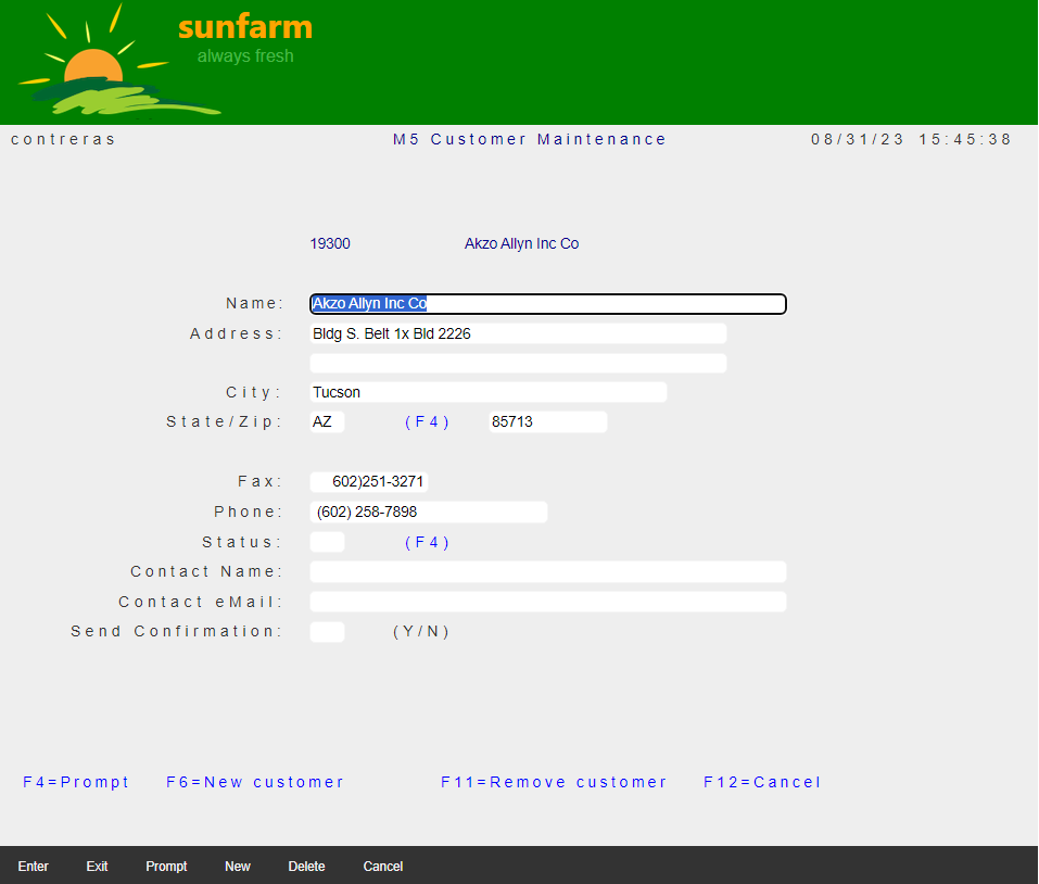
During Migration, in an attempt to preserve legacy label positioning (particularly when labels are right-aligned by hand), even when the new constants use a Modern Font family (not Monospaced), the Migration adds styles to artificially compensate with inter-character spacing (to end-up in the same ending column position) that gives the appearance of Old style Look.
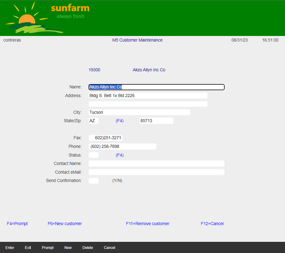
Visual inspection of some Pages clearly shows that most constants do not need such inter-spaced style and look better using normal spacing.
When the intension was to right-align by hand, there is a better way to do it, using CSS styling.
Modernize Constant Spacing
Change this:
<DdsRecord For="CUSTREC" KeyNames="F4 'Prompt'; F6 'New'; F11 'Delete'; F12 'Cancel';">
To this:
<DdsRecord For="CUSTREC" StretchConstantText=false KeyNames="F4 'Prompt'; F6 'New'; F11 'Delete'; F12 'Cancel';">
The right-aligned constants will lose their alignment, to fix change:
Affected constant:
<DdsConstant Col="20" ColSpan="-1" class="right-aligned-constant" Text="Name:" />
Properly right adjusted constant:
<DdsConstant Col="20" ColSpan="-1" class="right-aligned-constant" Text="Name:" />
Add the following style to ~/wwwroot/css/site.css
.right-aligned-constant {
    text-align: right !important;
}
Results
| Constants stretching | Constant normal spacing (some with right-alignment) |
|---|---|
 |
 |