Optimizing Function Key Placement for UX
Source
You can get the GitHub Source Files here.
Overview
The Application Page contains a <form> using a two-panel flex box layout where the following two panels (divisions) are rendered:
- The
Function keyspanel: Displays active command keys. - The
mainpanel: Displays active Application display records.
The flex box layout is very convenient, because the position and dimensions of the two two panels are auto-adjusted according to the Web Browser Window size.
The following image illustrates the layout of the two panels, where the Function keys panel is represented by a pale blue rectangle, while the main panel is represented by a light-green rectangle. The label represents the location name.
When Displayfiles are migrated, the default location used is VerticalLeft.
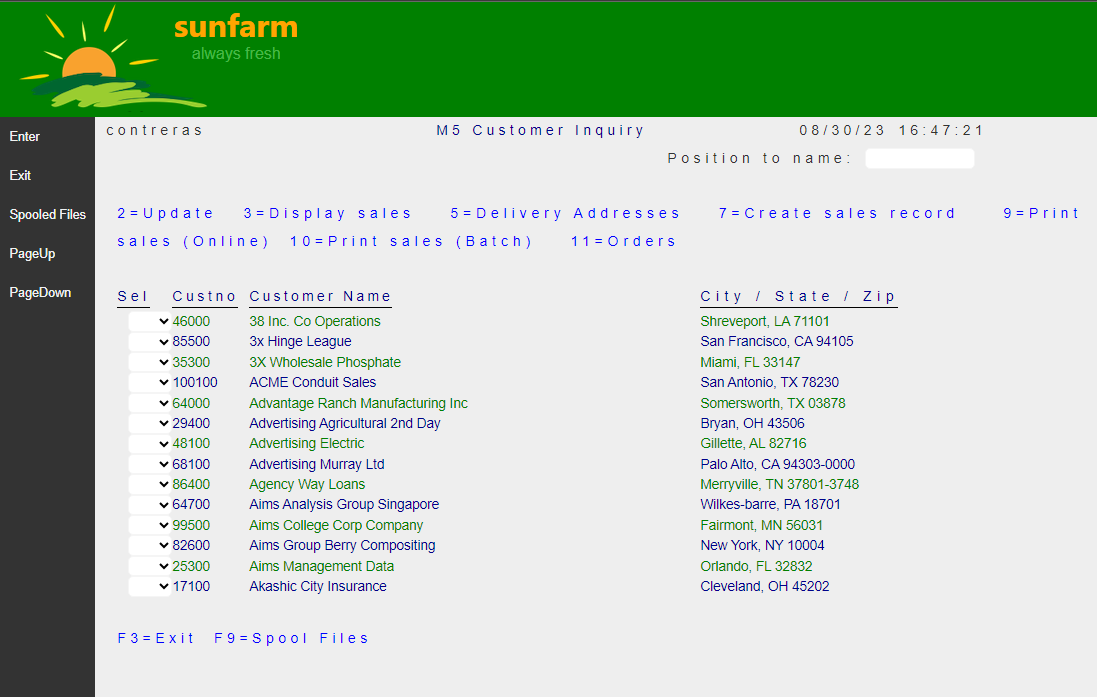
Note that for the two vertical locations the width of the Function keys panel is determined by the content width of the command key labels. As different Pages are rendered, the width of this panel varies and the panels appear to jump. This effect may be undesirable.
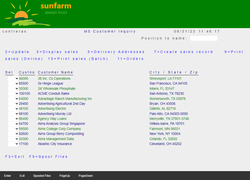
Selecting one of the horizontal locations may be a better choice. (Also on devices that are taller than wider - like a smart phones - this layout works better).
Function Keys Location Enhancement
To change the Function keys location, explicitly add the desired property value to the DdsFunctionKeys tagHelper on the Razor Page markup.
<DdsFunctionKeys Location="HorizontalBottom" />
Note: to consistently effect the
Locationof theFunction keysacross ALL Application Pages, perform a global Search/Replace operation (on *.cshtml file types).
Results
| Before | After |
|---|---|
 |
 |
